1. Introduction
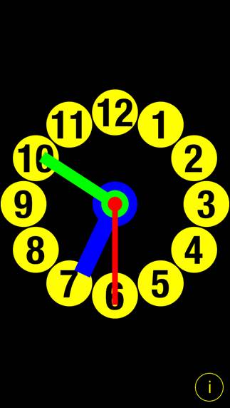
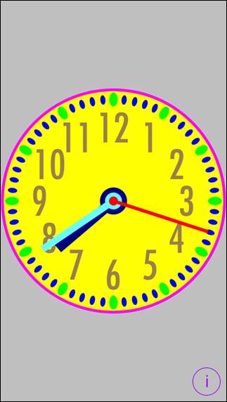
ClockIt is totally customizable analog
clock for iOS devices.
|
|
To change clock look just tap on part
you want to change and adjust the settings. Changes are visualized
immediately. ClockIt is delivered with many predefined
themes, which can be easy customized. New themes can by created by
duplication of existing themes. App supports iCloud data
synchronization – ClockIt themes and settings on all iOS devices with same
iCloud account will be synchronized. You can create infinitely many new
themes, which will be automatically shared by all your iOS devices. App “Help-function” available in the
app or on WWW contains detailed description of all functions and options. In the app has been implemented total
saving/restoration of state – it means that app might be interrupted at any
time (by phone call, pressing one of device buttons, screen lock) and your
data will not be lost. When app is activated next time all not saved data
will be restored. App is optimized for iOS7, iOS6, iOS5. |
Pictures in current documentation are
taken from iOS 7.x version of ClockIt. On devices, which are running older
versions of iOS (5.x and 6.x) some controls will look slightly different.
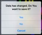
Following table contains couple of examples of such differences.
|
|
iOS5.x, iOS6.x |
iOS7 |
|
Picker |
|
|
|
Stepper |
|
|
|
Slider |
|
|
|
Text field |
|
|
|
Switch |
|
|
|
Alert |
and
|
and
|
2. View orientation
All app views work in portrait and landscape
orientation:
|
|
Portrait orientation |
or
|
|
Landscape orientation |
Just select orientation, which is most convenient
for you. View orientation can be change at any time.
3. Clock theme
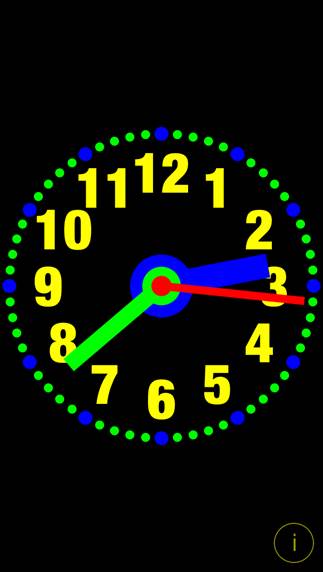
Clock theme is
collection of clock settings, such as colors, sizes, etc.
|
|
Picture shows all
ClockIt adjustable elements in different colors:
|
In more details clock
theme contains following settings:
1)
Theme name.
2)
Predefined indicator – marks predefined themes - themes which
were installed with app.
3)
Read-Only indicator - predefined themes are always
read-only and cannot be changed to editable. Read-only indicator can be used
for protecting of users themes from accidental changes.
4)
Clock face border color.
5)
Clock face color.
6)
Clock face radius factor – relation of clock face
radius to clock radius.
7)
Clock face border width factor – relation of clock border
width to clock radius.
8)
Show/hide seconds hand indicator
– determines if senonds hand is visible.
9)
Number of Clock numbers.
10) Number of Minute
marks
11) Number of Hour
marks.
12) Seconds hand length factor – relation of seconds hand
length to clock radius.
13) Seconds hand
width factor – relation of
seconds hand width to clock radius.
14) Seconds hand
axis radius factor – relation of seconds hand axis radius to clock radius.
15) Seconds
hand color.
16) Minute
hand length factor – relation of minute hand length to clock radius.
17) Minute
hand width factor – relation of minute hand width to clock radius.
18) Minute
hand axis radius factor – relation of minute hand axis radius to clock
radius.
19) Minute
hand color.
20) Hour
hand length factor – relation of hour hand length to clock radius.
21) Hour
hand width factor – relation of hour hand width to clock radius.
22) Hour
hand axis radius factor – relation of hour hand axis radius to clock
radius.
23) Hour
hand color.
24) Hour
mark height factor – relation of hour mark height to clock radius.
25) Hour
mark width factor – relation of hour mark width to clock radius.
26) Hour
mark color.
27) Hour
mark radius factor – relation of hour mark radius to clock radius. Here
“hour marks radius” is distance from clock center to clock hour marks.
28) Hour
mark type.
29) Minute
mark height factor – relation of minute mark height to clock radius.
30) Minute
mark width factor – relation of minute mark width to clock radius.
31) Minute
mark color.
32) Minute mark radius factor – relation of minute mark
radius to clock radius. Here “minute marks radius” is distance from clock
center to clock minute marks.
33) Minute
mark type.
34) Clock
numbers height factor – relation of numbers height to clock radius.
35) Clock numbers
color.
36) Clock
numbers radius factor – relation of clock numbers radius to clock radius.
Here “clock numbers radius” is distance from clock center to clock numbers.
37) Clock
numbers font name.
38) Clock
background color.
39) Settings
button color.
4. Clock view
|
|
It is view
you will usually see when you start the app. View
contains: ·
Clock, which you can customize ·
Settings-button When app was
terminated in another view, next time you start app you will be directed to
that view. |
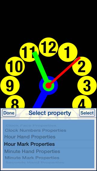
Here is
detailed description of controls available from Clock view:
|
Double tap on view |
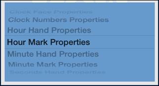
Will start Select property view. Selection
picker will pop-up and you will have possibility to choose clock element you
want to change or inspect: |
|
Swipe to the left |
Switch to next clock
theme. |
|
Swipe to the right |
Switch to
previous clock theme. |
|
Tap on clock
element |
Activates
one of property views dependent on what clock element was tapped: 2) Clock face 4) Hour hand 5) Hour mark 6) Minute hand 7) Minute mark 8) Seconds hand |
|
|
Activates Settings view – view used to change common
app parameters and options. |
4.1
Select property
|
|
Sometimes
tapping on clock element does not select exactly what you want. The reason
might be too small distance between clock elements or clock elements overlap.
In such case just double tap on screen - selection picker will pop-up and you
will have possibility to choose clock element to change or inspect. |
Controls in
this view:
|
|
Terminate
the view without selecting clock property. |
|
Tapping on
any place outside the view. |
Same as
Done-button. |
|
Double
tapping on any place outside the view. |
Same as
Done-button. |
|
|
Select
property and switch to property view. |
|
Double
tapping on picker. |
Same as
Select-button. |
|
|
Property
picker - selects required clock property. |
4.2
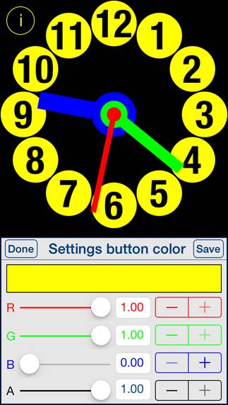
Background colors
|
|
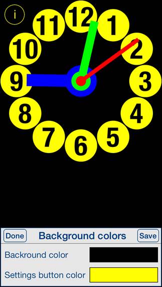
This view is used
for adjusting of colors for clock background and Settings-button. View is activated
by tapping on any place outside clock face or by using Select property view. When activated
Settings-button usually located in bottom-right corner is moved to top-left
corner to avoid covering it by the view. |
Controls in
this view:
|
|
Terminate
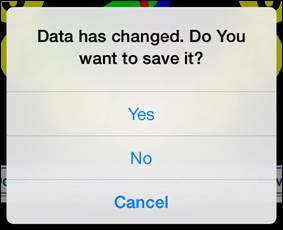
view without saving. When changes
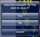
were made, user will be prompted for decision what to do by showing the
following alert:
User will
have three possibilities: 1)
Save changes and exit, by choosing “Yes”. 2)
Discard changes and exit, by selecting “No”. 3)
Continue editing, by selecting “Cancel”. |
|
Tapping on any
place outside the view. |
Same as
Done-button. |
|
|
Save data
and terminate view. |
|
|
Tapping on
it activates Color picker for Settings-button. |
4.3
Clock face
|
|
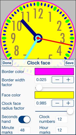
This view is used
for adjusting of properties of clock face. View is activated
by tapping on empty place on clock face or by using Select property view. |
Controls in
this view:
|
|
Terminate
view without saving. When changes
were made, user will be prompted for decision what to do by showing the Data has changed alert. |
|
Tapping on
any place outside the view. |
Same as
Done-button. |
|
|
Save data
and terminate view. |
|
|
Tapping on
it activates Color picker for Face border color. |
|
|
Slider and
stepper used for adjusting of Clock face border
width factor. |
|
|
Tapping on
it activates Color picker for Clock face color. |
|
|
Slider and
stepper used for adjusting of Clock face
radius factor. |
|
|
Switch for
hiding/showing of seconds hand – setts Show/hide seconds hand indicator. |
|
|
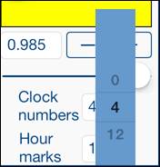
Determines
number of Clock numbers, when taped picker with
possible numbers will pop-up:
|
|
|
Determines
number of Minute marks, when taped picker with possible numbers will
pop-up. |
|
|
Determines
number of Hour marks, when taped picker with possible numbers will
pop-up. |
4.4
Clock numbers
|
|
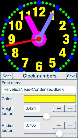
This view is used
for adjusting of properties of clock numbers. View is activated
by tapping on any clock number or by using Select
property view. |
Controls in
this view:
|
|
Terminate
view without saving. When changes
were made, user will be prompted for decision what to do by showing the Data has changed alert. |
|
Tapping on
any place outside the view. |
Same as
Done-button. |
|
|
Save data
and terminate view. |
|
|
Tapping on
it activates Font picker for clock numbers. |
|
|
Tapping on
it activates Color picker for clock numbers. |
|
|
Slider and
stepper used for adjusting of Clock
numbers height factor. |
|
|
Slider and
stepper used for adjusting of Clock
numbers radius factor. |
4.5
Hour hand
|
|
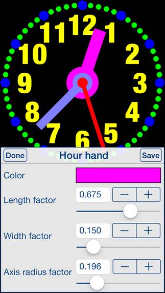
This view is used
for adjusting of properties of hour hand. View is activated
by tapping on hour hand or by using Select
property view. |
Controls in
this view:
|
|
Terminate
view without saving. When changes
were made, user will be prompted for decision what to do by showing the Data has changed alert. |
|
Tapping on
any place outside the view. |
Same as
Done-button. |
|
|
Save data
and terminate view. |
|
|
Tapping on
it activates Color picker for hour hand. |
|
|
Slider and
stepper used for adjusting of Hour hand
length factor. |
|
|
Slider and
stepper used for adjusting of Hour hand
width factor. |
|
|
Slider and
stepper used for adjusting of Hour
hand axis radius factor. |
4.6
Hour mark
|
|
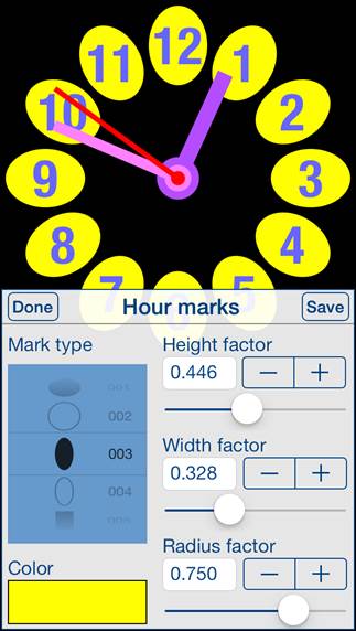
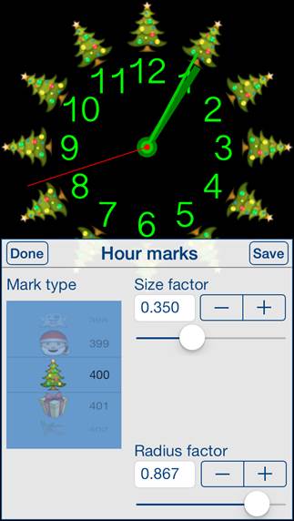
This view is used
for adjusting of properties of hour marks. View is activated
by tapping on any hour mark or by using Select
property view. Dependent on mark
type, different sets of control will be shown. |
Controls in
this view:
|
|
Terminate
view without saving. When changes
were made, user will be prompted for decision what to do by showing the Data has changed alert. |
|
Tapping on
any place outside the view. |
Same as
Done-button. |
|
|
Save data
and terminate view. |
|
|
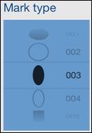
Picker for selecting of mark type. There are 708
different mark types to choose: ·
Circles ·
Ellipses, ·
Squares ·
Rectangles ·
Stars ·
Graphical symbols ·
Apple Color Emoji |
|
|
Tapping on
it activates Color picker for hour mark. |
|
|
Slider and stepper used
for adjusting of Hour mark height factor. |
|
|
Slider and stepper used
for adjusting of Hour mark width factor.
|
|
|
Slider and
stepper used for adjusting of Hour mark
radius factor. |
|
|
Slider and
stepper used for adjusting of hour mark size factor – relation of hour mark
size to clock radius. Slider and stepper are used when height and width of
hour mark are scaled proportionally – “Size factor controls” are shown
instead Height factor controls
and Width factor controls. |
4.7
Minute hand
|
|
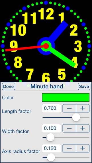
This view is used
for adjusting of properties of minute hand. View is activated
by tapping on minute hand or by using Select
property view. |
Controls in
this view:
|
|
Terminate
view without saving. When changes
were made, user will be prompted for decision what to do by showing the Data has changed alert. |
|
Tapping on
any place outside the view. |
Same as
Done-button. |
|
|
Save data
and terminate view. |
|
|
Tapping on
it activates Color picker for minute hand. |
|
|
Slider and
stepper used for adjusting of Minute
hand length factor. |
|
|
Slider and
stepper used for adjusting of Minute hand
width factor. |
|
|
Slider and
stepper used for adjusting of Minute
hand axis radius factor. |
4.8
Minute mark
|
|
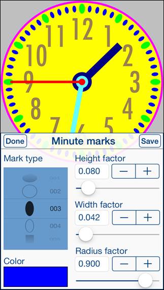
This view is used
for adjusting of properties of minute marks. View is activated
by tapping on any minute mark or by using Select
property view. Dependent on mark
type, different sets of control will be shown. |
Controls in
this view:
|
|
Terminate
view without saving. When changes
were made, user will be prompted for decision what to do by showing the Data has changed alert. |
|
Tapping on
any place outside the view. |
Same as
Done-button. |
|
|
Save data
and terminate view. |
|
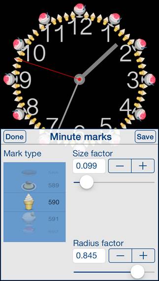
|
Picker for selecting of mark type. There are 708
different mark types to choose: ·
Circles ·
Ellipses, ·
Squares ·
Rectangles ·
Stars ·
Graphical symbols ·
Apple Color Emoji |
|
|
Tapping on
it activates Color picker for minute mark. |
|
|
Slider and stepper used
for adjusting of Minute mark height
factor. |
|
|
Slider and stepper used
for adjusting of Minute mark width factor.
|
|
|
Slider and
stepper used for adjusting of Minute
mark radius factor. |
|
|
Slider and
stepper used for adjusting of minute mark size factor – relation of minute
mark size to clock radius. Slider and stepper are used when height and width
of minute mark are scaled proportionally – “Size factor controls” are shown
instead Height factor controls
and Width factor controls. |
4.9
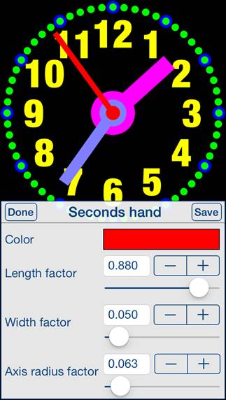
Seconds hand
|
|
This view is used
for adjusting of properties of seconds hand. View is activated
by tapping on seconds hand or by using Select
property view. |
Controls in
this view:
|
|
Terminate
view without saving. When changes
were made, user will be prompted for decision what to do by showing the Data has changed alert. |
|
Tapping on
any place outside the view. |
Same as
Done-button. |
|
|
Save data
and terminate view. |
|
|
Tapping on
it activates Color picker for seconds hand. |
|
|
Slider and
stepper used for adjusting of Seconds
hand length factor. |
|
|
Slider and
stepper used for adjusting of Seconds
hand width factor. |
|
|
Slider and
stepper used for adjusting of Seconds
hand axis radius factor. |
4.10 Color picker
|
|
This view is used
for adjusting of selected color. View is activated
by tapping on visualization of color you want to change or inspect. |
Controls in
this view:
|
|
Terminate
view without saving. When changes
were made, user will be prompted for decision what to do by showing the Data has changed alert. |
|
Tapping on
any place outside the view. |
Same as
Done-button. |
|
|
Save data
and terminate view. |
|
|
Visualization
of color. |
|
|
Slider and
stepper used for adjusting of red component of color. |
|
|
Slider and
stepper used for adjusting of green component of color. |
|
|
Slider and
stepper used for adjusting of blue component of color. |
|
|
Slider and
stepper used for adjusting of opacity value of color. |
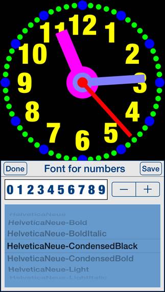
4.11 Font picker
|
|
This view is used
for selecting of clock numbers font. View is activated
by tapping on font name in corresponding view. |
Controls in
this view:
|
|
Terminate
view without saving. When changes
were made, user will be prompted for decision what to do by showing the Data has changed alert. |
|
Tapping on
any place outside the view. |
Same as
Done-button. |
|
|
Save data
and terminate view. |
|
|
Visualization
of selected font and stepper for selecting of previous/next font. |
|
|
Picker for
selecting of font name. |
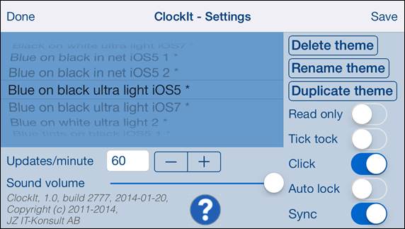
5. Settings view
|
|
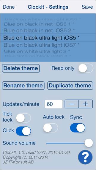
This view
allows you to configure system parameters and settings. From this view you
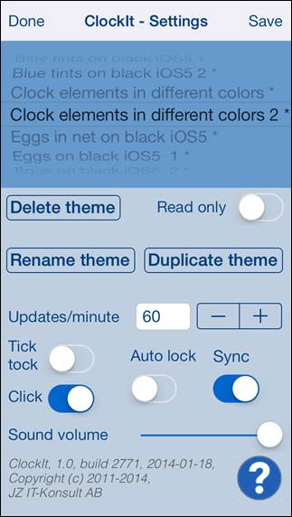
have also access to Help view. In this view
you can select active clock theme and adjust settings common for all themes. Here you can
also do some maintenance of themes – rename, delete and duplicate of themes. |
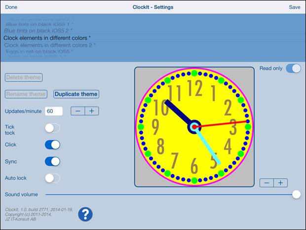
On iPad
Settings view contains one more element – visualization of selected clock
theme:
Here is
detailed description of controls available from Settings view:
|
|
Terminate
view without saving of data. When changes
were made, user will be prompted for decision what to do by showing Data has changed alert. |
|
Swipe to the
right |
Same as
Done-button. |
|
|
Save data
and terminate view. |
|
|
Show Help view. |
|
|
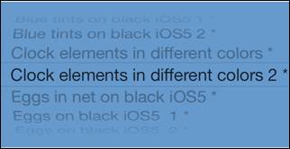
Theme picker
– used for selection of active clock theme. |
|
|
Read-only indicator for theme. |
|
|
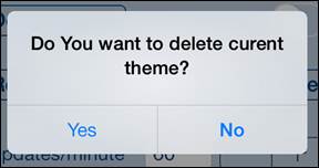
Button
activates deletion of theme. To delete theme tap “Yes”:
|
|
|
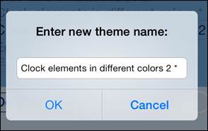
Button activates
renaming of theme. Enter new name and confirm it by tapping on “OK”:
|
|
Double tap on Theme
picker |
Same as
Rename-button. |
|
|
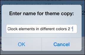
Button activates
duplication of theme. Enter name for new copy and confirm it by tapping on
“OK”:
|
|
|
Determines
frequency of clock update. When frequency is 1 update/minute seconds hand is not
shown. When you chose higher update frequency the seconds hand will move more
smoothly. |
|
|
Activates/deactivates clock “tick-tock” sound.
When activated clock tick-tocks every second. |
|
|
Activates/deactivates
“Auto lock” of your iOS device. Use it with care –
setting Auto-lock to off when iPhone/iPad is not connected to the charger
will quickly empty device battery. |
|
|
Activates/deactivates
of synchronization of all clock setting with iCloud. When deactivated only
theme data is synchronized. |
|
|
Determines
if “click” sound is used in app. |
|
|
Determines volume of
sound effects of app. |
6.
Help view
|
|
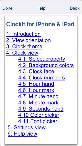
This view
shows user guide for app. |
Controls
available in this view:
|
|
Terminate
view. |
|
Swipe to the
right |
Same as
Done-button. |
|
|
Navigate to
previous place in help. |
